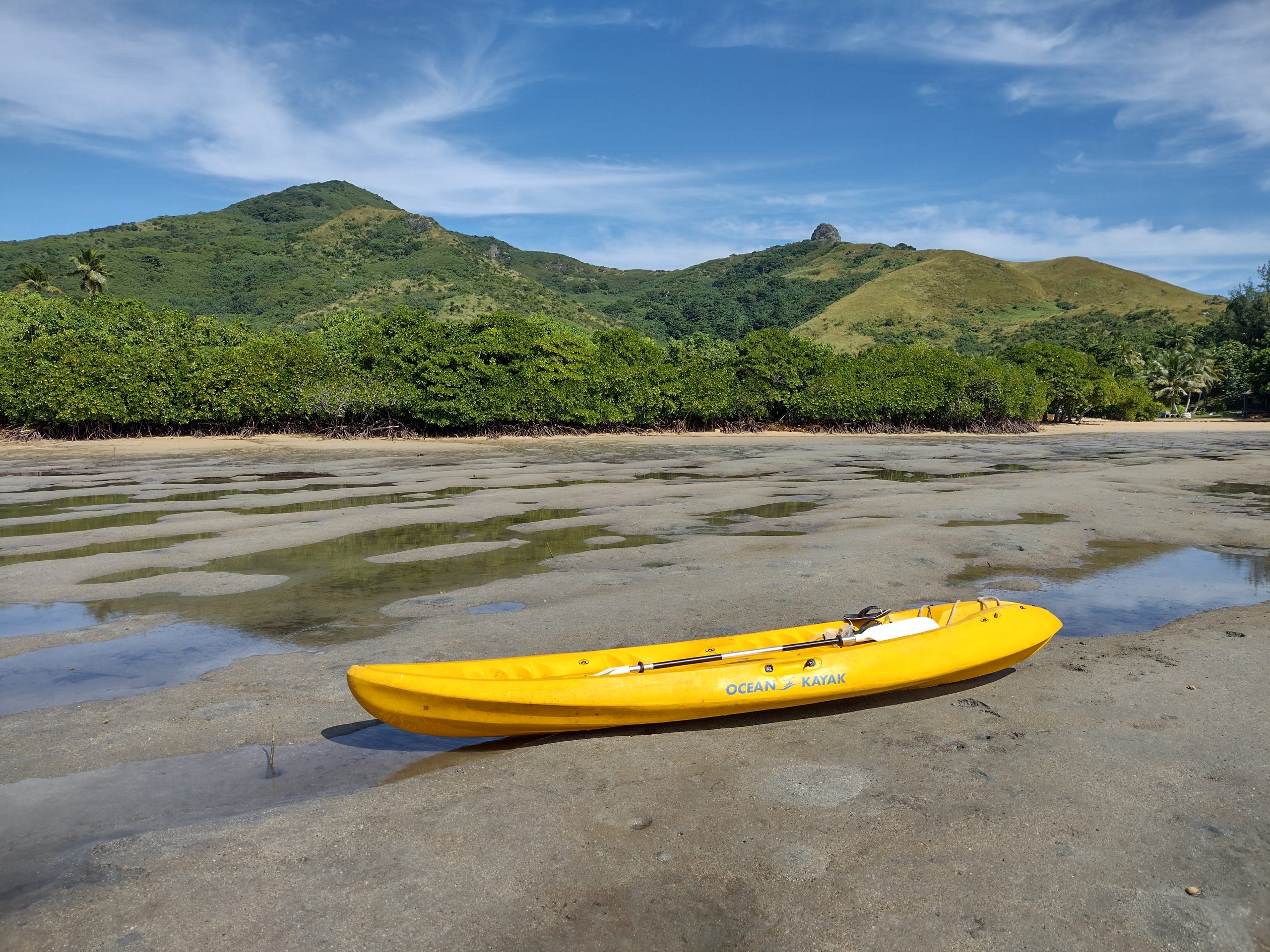
Beaches…desert…sand-coloured rocks and adobe buildings. From Scotland’s West Coast to southern Sri Lanka and the high dunes of Merzouga, Morocco, we encounter a lot of sand on these painting holidays. But what colour is sand? Quite often, our eyes deceive us.
Thinking of holiday destinations around the world, we’ll be aware that there are almost limitless shades of ‘sand’, a name given by the fashion industry to a kind of dull beige. There are the sparkling white sands of the Caribbean; golden orange in parts of Asia, and at sunset, Wadi Rum turns a luminous pink. In Scotland, we have Achmelvich (white) and Achnahaird (pink) beaches within just a few miles of each other. Sand, of course, is not a substance in and of itself. It is made up of shells, stones and rocks, crushed and smoothed by tides, and composed of many different textures and colours depending on what formed it. If we take handful of sand in our hands and spread it around to see the individual grains, we may be surprised at some of the colours we find within it.
When painting sand, and particularly when sketching quickly outside, we will be looking for the overarching colour we see when viewing it from afar, as opposed to examining the grains under a microscope. What we attempt to replicate will be the collective effect of the individually coloured grains, creating what the eye perceives as a solid. So what colour is it really?
Back to the ‘colour-matching races’ that we often play on a Vistas holiday. I especially enjoy the sand ones, because many people find them tricky; this is due to an almost universal instinct to first reach for a colour which is not going to work. Experienced painters will undoubtedly know what I’m talking about. What colour is sand? It’s simpler to ask: Which colour is rarely (if ever) in sand? The answer, of course, is yellow.
I watch patiently as individuals struggle to achieve the desired ‘match’ by using yellow as their base and adding every colour in their palette into it, creating a muddier (and usually greener) mess, more reminiscent of a grassy hillside than a beach or a dune. There are quite a few other colours which can be used to mix a very close representation of any patch of sand. They vary from location to location, from palette to palette and from painter to painter but they all have one thing in common: they don’t include yellow. If someone is resistant to this idea, I pick up a handful of the sand we’re attempting to ‘match’ and place a small pile on their paper. It is immediately apparent how unyellow the pile is, and if they look closely, they’ll pick out blues, purples, greys, siennas. It’s a lightbulb moment. Putting the whole idea of yellow out of their minds can revolutionise their colour mixing and the way they look at the landscape.
I’m not going to tell you, here, the ‘answer’ to which colours are often found in the sands we encounter, in case you are booked onto a trip where a colour-matching exercise will take place! Suffice to say, you need no more than three, and often just two, of the colours that are in your palette, and less is usually more. Quite often when I’m sketching quickly, I’ll just pass over the faintest lick of one colour to represent a beach. And it definitely won’t be yellow.
There are other reasons to be wary of yellow. I find that many people are reliant upon it to the point of addiction, and its overuse can dominate their sketchbooks. It’s an indispensable colour, of course; it’s a primary, and absolutely vital for greens. I don’t recommend using a ready-made version (apart from viridian, for specific purposes – see previous post). Greens are quick and easy to make and will always look more natural than their commercial equivalent, especially if you leave the colours loosely mixed. Yet finding the perfect yellow is not easy, and has become a bit of a crusade for me in recent years. Lots of yellows are not very lightfast, which may not be an issue for a beginner or within a sketchbook, but I try to get into the habit of choosing only pigments with a high lightfastness rating – who knows when you’ll produce that masterpiece? In addition, a lot of them are quite opaque, and often staining, making it difficult to correct errors and giving a muddy look in mixes. Even a transparent yellow can sometimes dull the translucence when painting water.
Yellow can be a habit. Complete beginners, when asked ‘How do we make colours lighter?’ (fishing for the suggestion to add more water), will sometimes answer ‘Add yellow?’ Naturally, I will then demonstrate what happens if you try to lighten blue by adding some yellow. It’s becoming a bit of an obsession with me, perhaps unfairly, to steer people away from its excessive use, or to at least experiment with reduction. That’s why I set ‘limited palette’ exercises, using three or even two colours only, in a landscape composition, and it’s surprising how fresh your work can become, when forced out of a particular colour-comfort zone.
If you’re on a trip and I introduce the limited palette instruction early, you can be sure there’s someone in the group with an unhealthy attachment to yellow. Could it be you?
Yellows I love:
Transparent yellow, Winsor & Newton
Transparent yellow, Schminke: Horadam
Jackson’s yellow light, Jackson’s (a good all-rounder)
Sennelier yellow light, Sennelier
Lemon yellow, Daniel Smith (available in a tube only)
Quinacridone Gold, Jackson’s. Not to be overused, though, as it’s a very powerful colour. Keep it for those amazing greens, and don’t have it as your only yellow.
Quinacridone Gold, Daniel Smith (tube only)
Yellows to treat with caution:
Lemon yellow, unless you can find one that’s transparent and reasonably lightfast, like the Daniel Smith version above. Also bear in mind it can be quite a cold colour.
Cadmium yellows: Opaque and can be staining. Although a lovely, mid-tone colour, there are better alternatives if you hunt for them. Try Indian yellow, Winsor & Newton or Daniel Smith (tube only) or New Gamboge, Daniel Smith (tube only) instead.
Yellows to avoid:
Yellow Ochre. Not really a yellow; it’s opaque, staining and overpowering.
I suggest using Raw Sienna instead (check for transparency). Winsor & Newton’s is good, but I especially love Sennelier’s. It is not a primary yellow, of course, but something else entirely.
Stockists I use:
Jackson’s: www.jacksonsart.com A large online store with most things you’ll ever need; speedy service and good prices. Their own brand is very good value and they make a small nod to sustainability in the packaging (though this could be improved).
Cass Art: www.cassart.co.uk
A friendly small business, online and with many physical shops around the UK. Frequent sales and offers.
The Art Shops: www.theartshops.co.uk
Very small, old, family business with physical shops in Yorkshire and a wonderful framing service. Limited stock held, but it includes some unusual products you won’t find elsewhere. Frequent offers and discounts.
Support small businesses whenever possible!