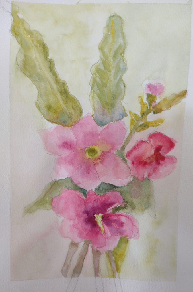
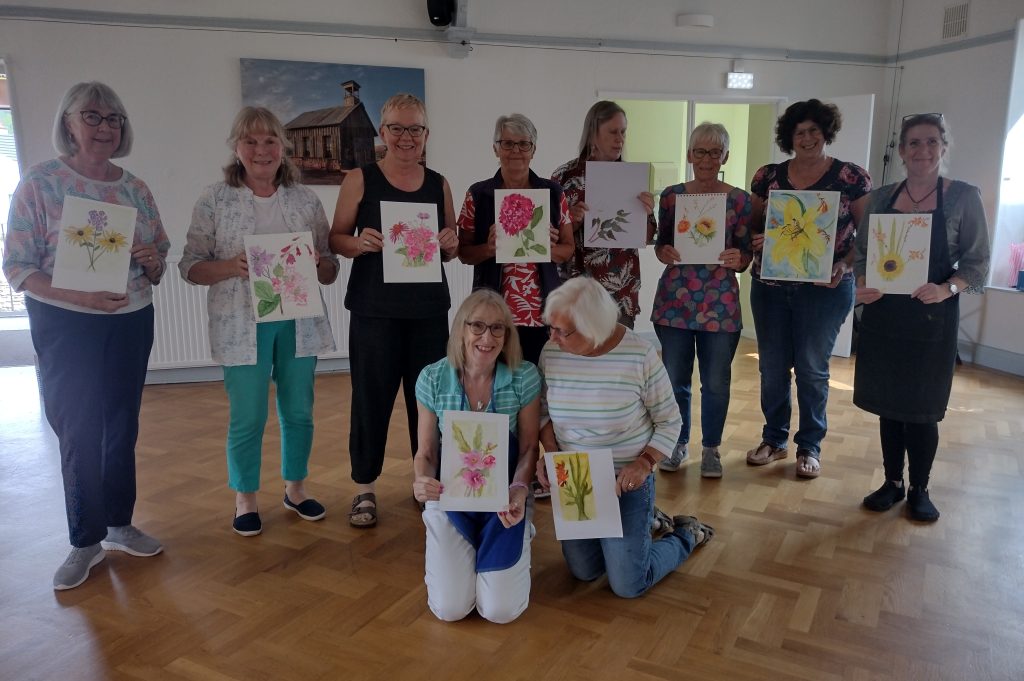
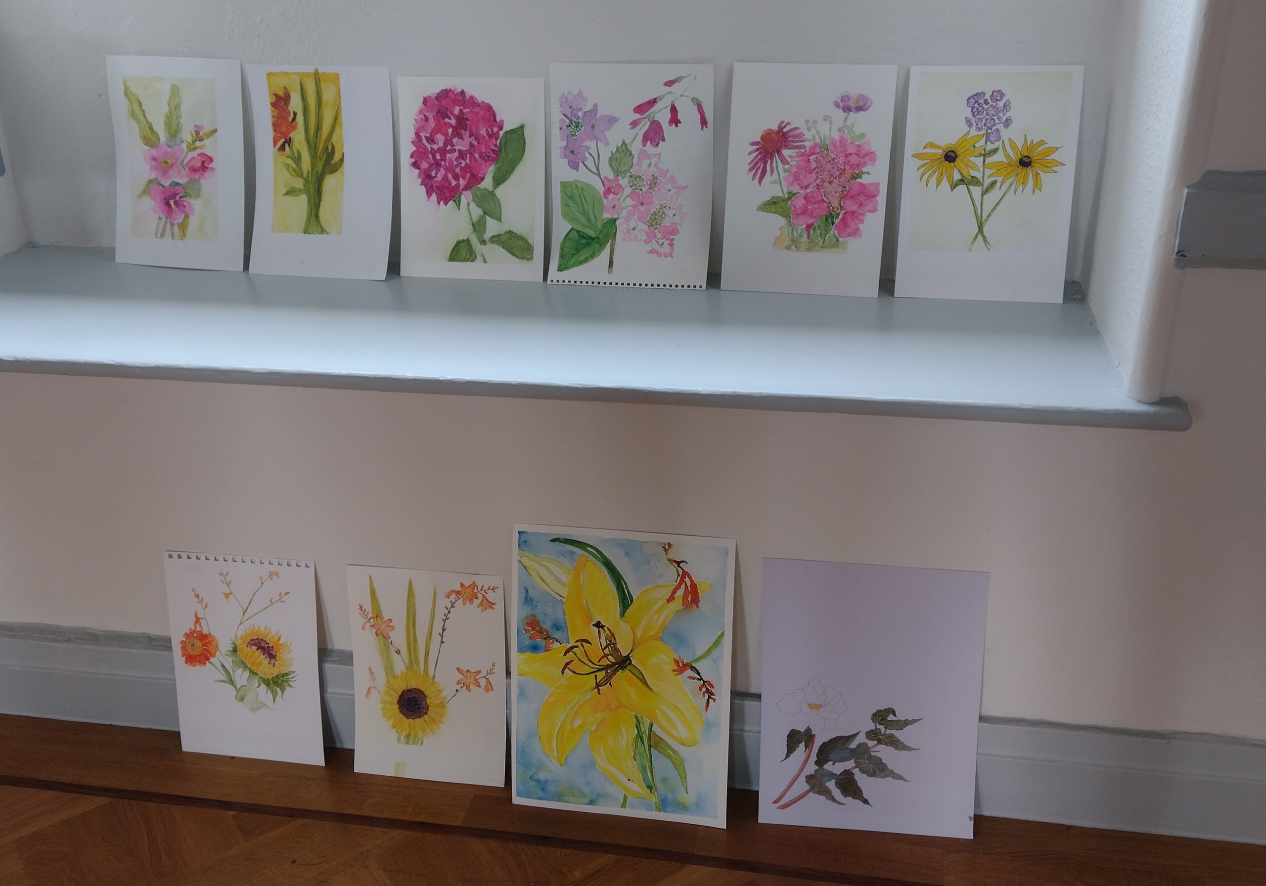
After a break of several months of personal travel without any Vistas departures, it was both a novelty and a challenge to be back in the saddle; a week ago I hosted a one-day workshop for a lovely bunch of ten ladies in the village where I’m house-sitting for a month.
It just so happens that Helen, whose two beautiful black cats I’m caring for, is a regular client on Vistas holidays, and she suggested the workshop as ‘something to do’ while I’m staying here. (As if there was any shortage, with beach and woodland walks, a sunny garden and plenty of admin to catch up on!) She also wanted to join in, of course, so I needed to arrive at her house two days earlier than planned, to sort out the very technical equipment such as empty jam jars to act as water pots, and saucers to use as circle templates. Oh, and to source an appropriate lunch, naturally.
It felt great to be back in front of a ‘class’, doing what I do best, although apart from Helen, none of these faces were known to me and they were all at different stages in their watercolour journeys. One or two had just come along for fun, and I hope that’s what they found!

The theme was ‘Focus on Limited Palette’ and the subject was flowers, which are growing profusely in gardens all around the village, including the one I’m currently minding; the summer has been warm and damp, and the growth is rampant. The gardens here are an art form in themselves and I’m always amazed at what can be achieved south of the border compared with the windswept, salty north. We picked hydrangeas; daisies of all colours and sizes; mallows and geraniums; others brought lilies, a sunflower and various others I couldn’t name. One brought a begonia in a pot – why not! The brief was that they shouldn’t be too small or fiddly, and hopefully they would have visibly obvious areas of colour. I was hoping for a lot of variety and that’s what we had.
All the flowers were pooled together and placed in water while we got stuck into the morning’s exercises – the learning part – then, after lunch, everyone chose just three stems (multiple blooms on a stem count as one) which they felt worked together compositionally and in terms of colour. We then put all the lessons into practice – the fun part.
We started with an introduction to Colour Theory and I gave everyone six blobs of watercolour on their palette: the three primary colours, with a warm and cool version of red, blue and yellow.
After identifying what the colours were and explaining the concept, we then went on to paint a colour wheel using all six pigments, forming just three secondaries and no tertiaries in this instance. This showed us clearly which of the six we should be mixing to achieve the ‘cleanest’, brightest orange, violet and green, should that be the colour we are looking for. Of course, and especially in nature, the most vivid mix isn’t always what we are aiming for, so we then went on to paint a colour grid, showing all four mixing possibilities for orange, for green, and for violet.
Everyone was astonished at what a difference it makes, simply swapping one blue for a different one, or a red, when mixing. When making a violet, the combination of warm (cadmium) red and cool (Prussian) blue forms more of a brown, as the green tinge to the Prussian blue acts as the red’s complimentary, forming its shadow colour, and almost has the effect of mixing all three primaries together.
After choosing three flowers each for the afternoon’s painting, I asked them to study the main colours within their small arrangement, and to choose just three of the watercolours they were given in the morning. I had washed out all their palettes at lunchtime in readiness for this challenge!
If their flowers were a bright, vivid orange, they would probably need to choose a warm yellow and a warm red, making a bright, warm orange. They would need to be careful with the greens, then, as to which blue to choose. This was helped by checking the grids they painted earlier. If their blooms were a delicate pink or purple, they’d almost certainly need the cool red and warm blue. They may then choose either yellow depending on the greens within the stems and leaves; the majority picked the cool (lemon) yellow.

At the end of the afternoon, it was incredible to see the results of the day, and how just three colours can mix (a version of) anything you may need for a given subject. Of course, the key is in choosing which three colours, though they’d undoubtedly be based on the three primaries. Within these three colours, though, are hundreds of options which vary not only by pigment but also by the make: for instance, I am on a constant quest to find the perfect cool blue. I dislike Prussian blue (for various reasons) across all makes, but it was useful for these exercises. In my own palette, I prefer a greenish indigo, but these vary dramatically from one brand to another, and the research is ongoing. Additionally, I find burnt sienna simply indispensable in my palette, especially for landscapes (not so much for flowers) and this can sometimes act as my ‘red’.
There were many lessons learned during the workshop but the most important one, I am sure everyone would agree, is that three colours are enough for any individual painting; six colours can be enough for almost all your paintings (but not all used at the same time!) and that the practice of limited palette is the very best way to avoid making ‘mud’.
Thank you, ladies of Storth, for a very enjoyable day, and all your paintings were amazing!

